Amazon | Alexa | CRM email redesign
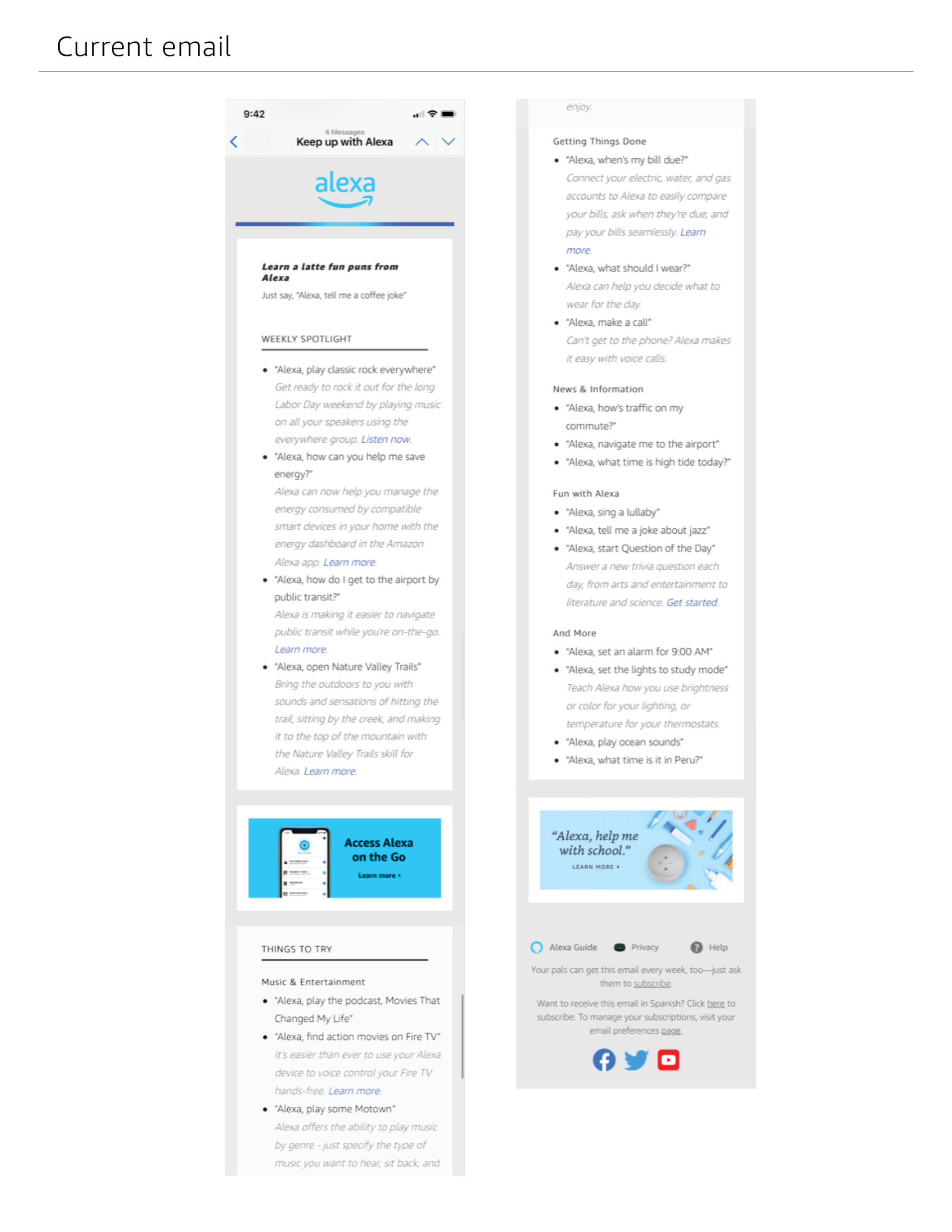
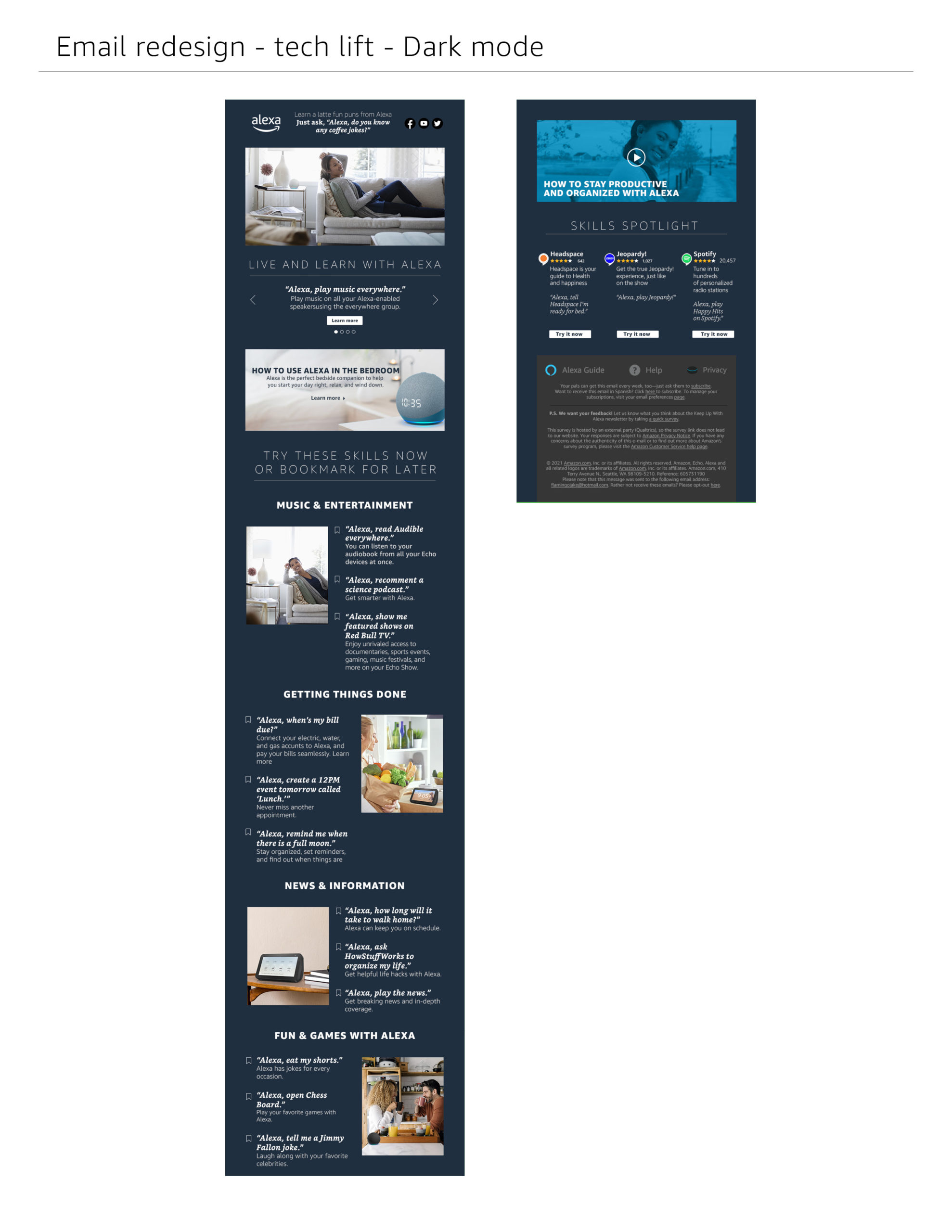
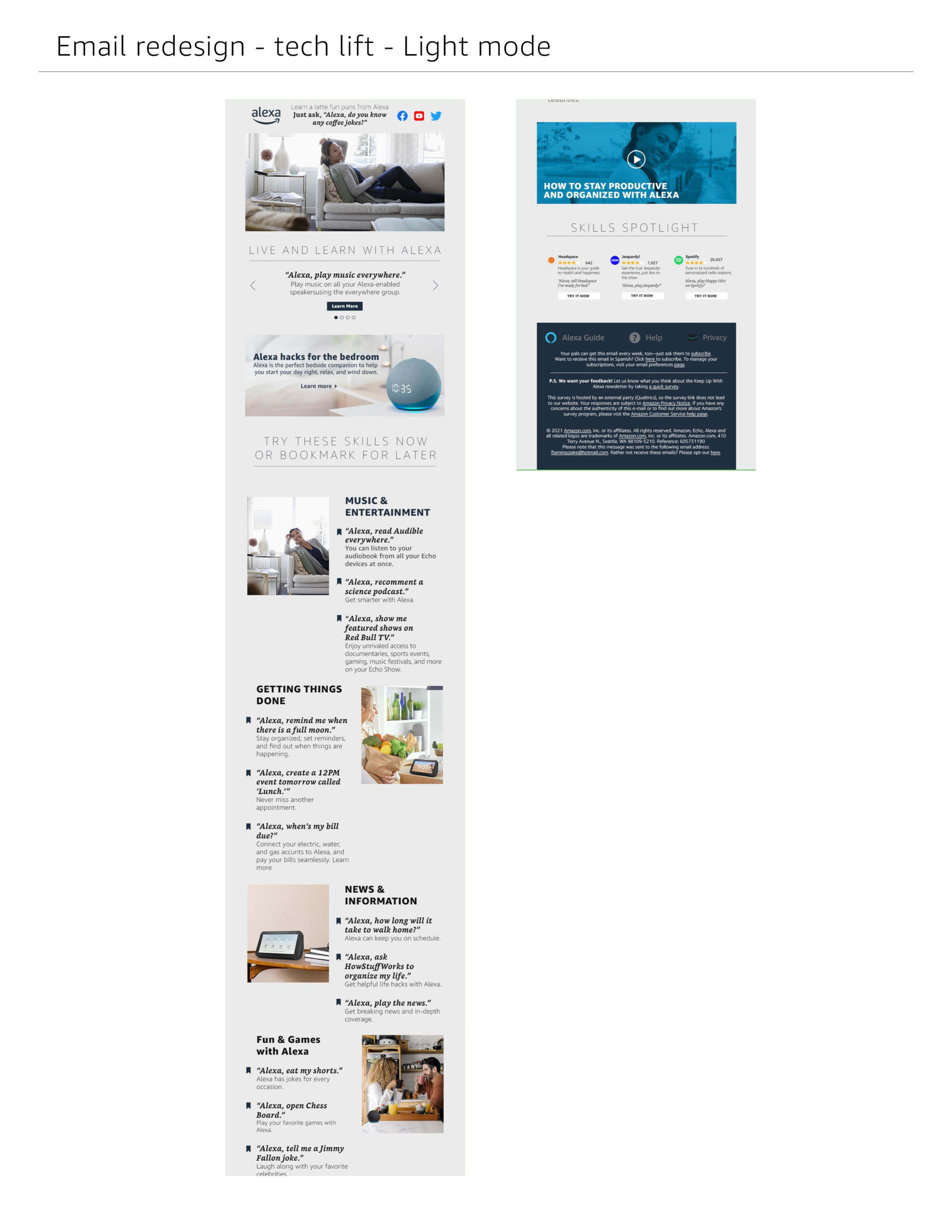
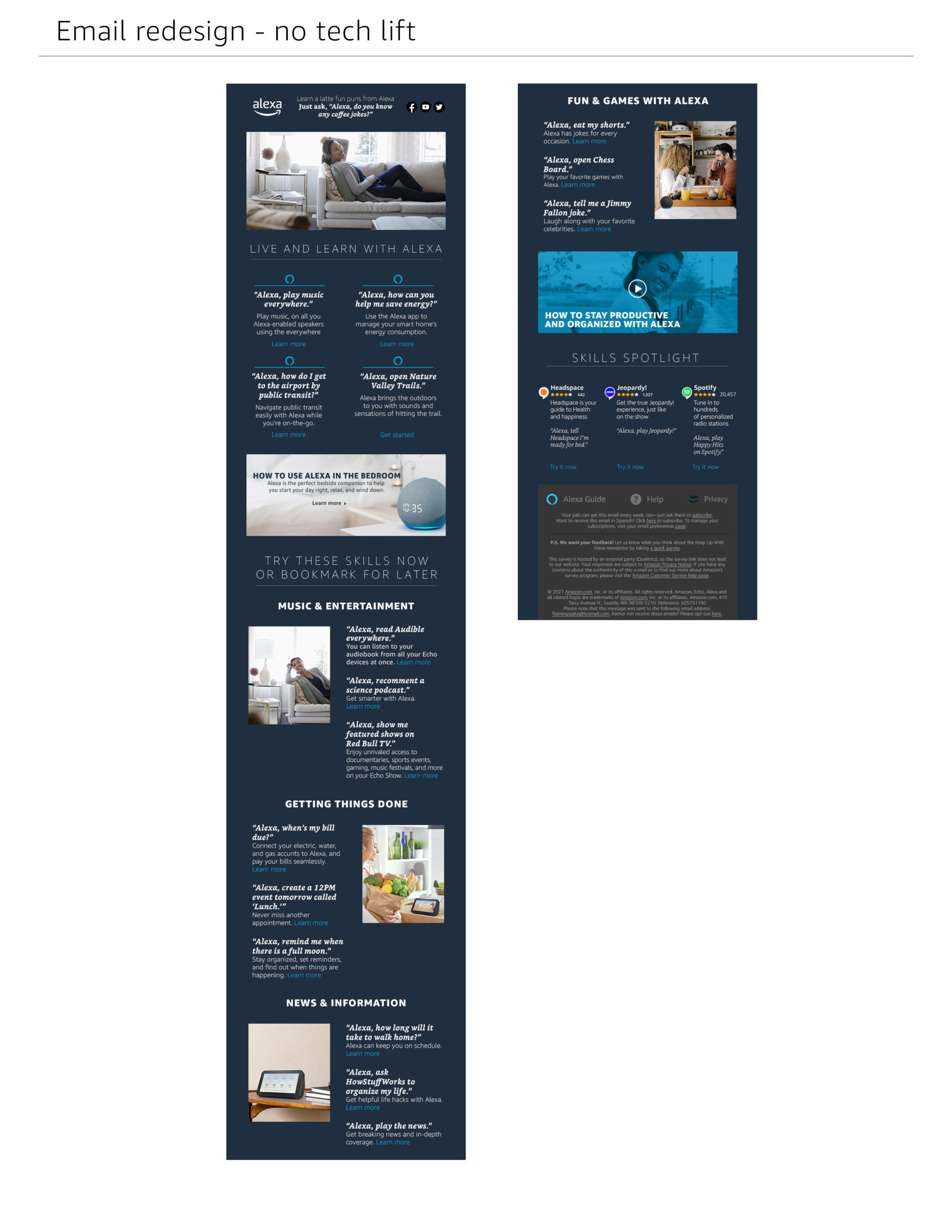
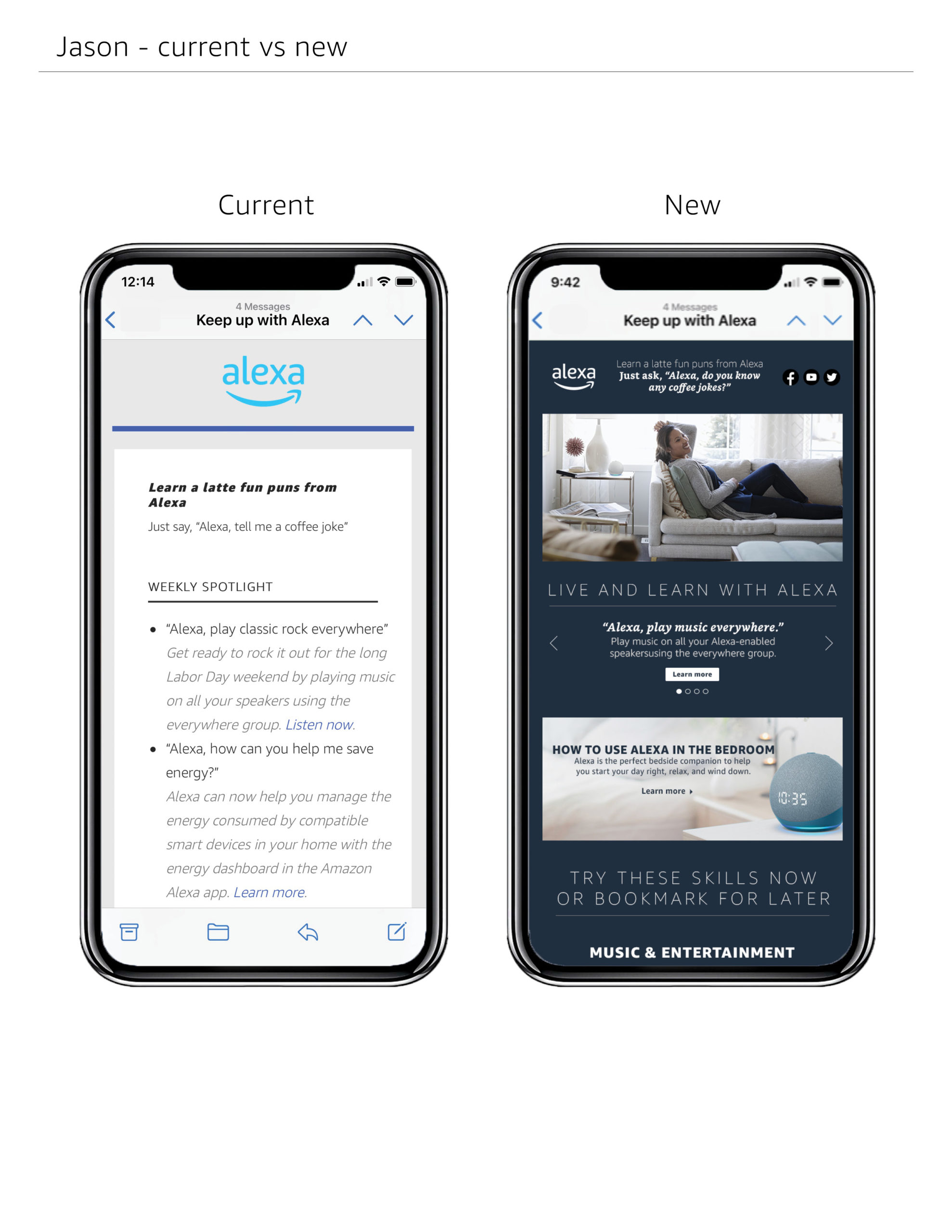
The Alexa CRM email, a weekly communication from Amazon to Alexa owners, required a redesign after years of using the same template. My team led the redesign effort. Below is the deck I created for my redesign submission, presenting two versions—one without tech limitations and another within the current tech boundaries.
Project scope
- Scrape info from the current email.
- Develop a new layout.
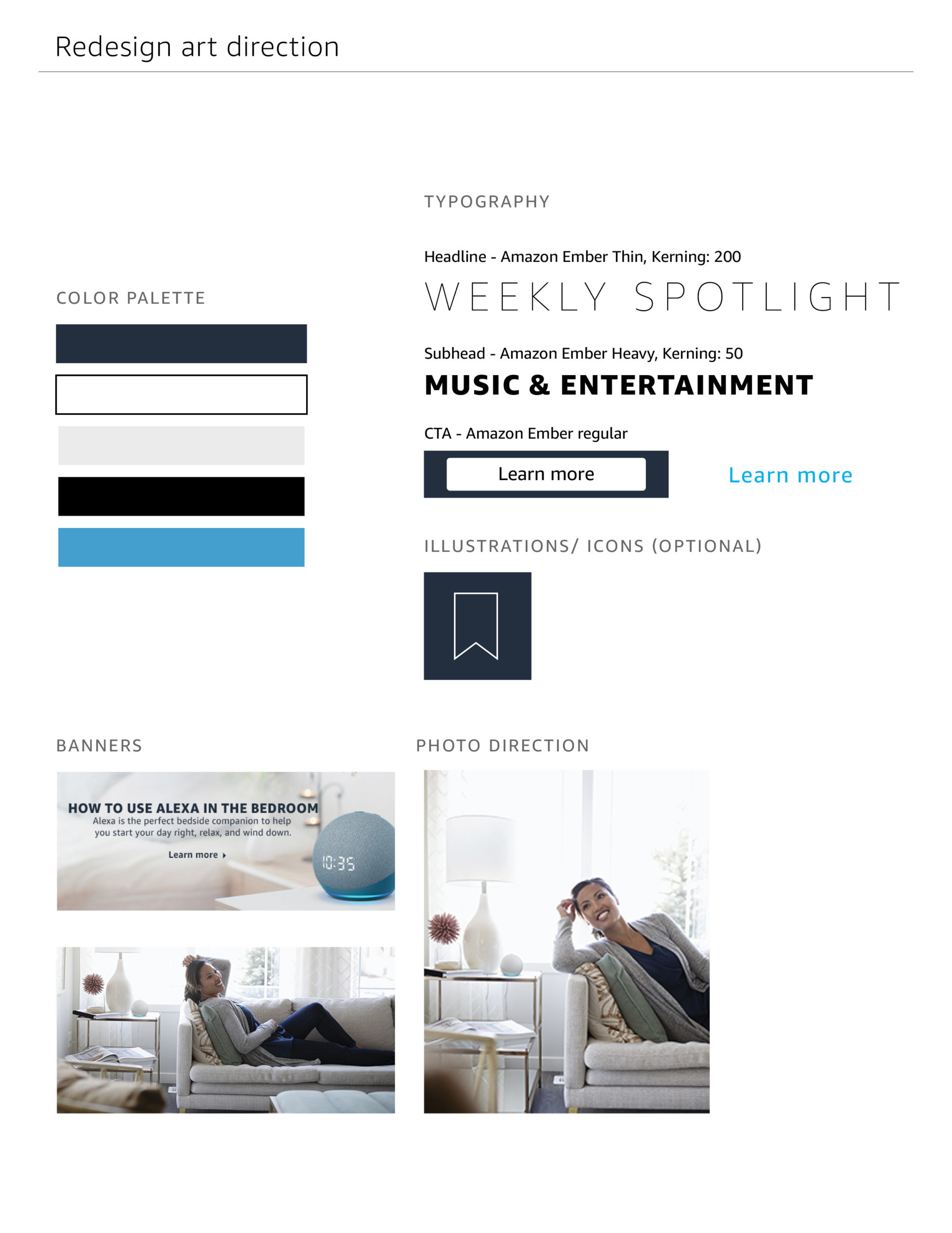
- Design the hero, middle, and 50/50 banners for each section.
- Tech lift version includes a rotator and bookmark icon function for “Live and Learn with Alexa.”
- Non-tech lift version includes text links for the same features and a text-based bookmark section.
My role
- Graphic designer
- UX designer
The challenge
- Create a mobile-first layout.
- Design banners.
- Choose a color palette.
- Develop a presentation deck for the team.
