King 5 News | Mobile UX design | Redesign navigation & news feed

King 5 News | Mobile UX design | Redesign navigation & news feed

The problem

In 2019, King 5 News revamped their mobile app with a redesigned user interface. Users faced challenges in navigation and noted a scarcity of news topics in the main feed. To address this, I improved the navigation system and diversified the main news feed for an enhanced user experience.

The outcome

The new quick navigation and updated menu seamlessly guide users to specific news stories. The diverse range of news topics on the main feed earned positive user feedback.

My contribution

I led the full design of this case study, from research through visual design.

Discovery

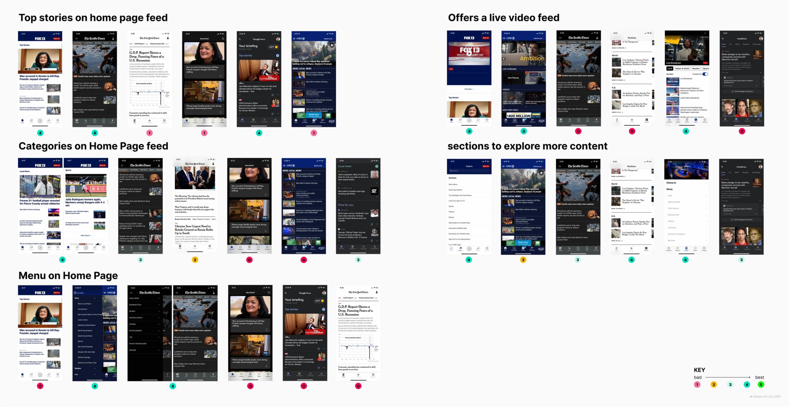
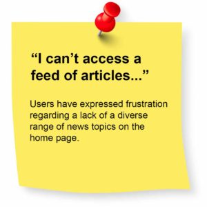
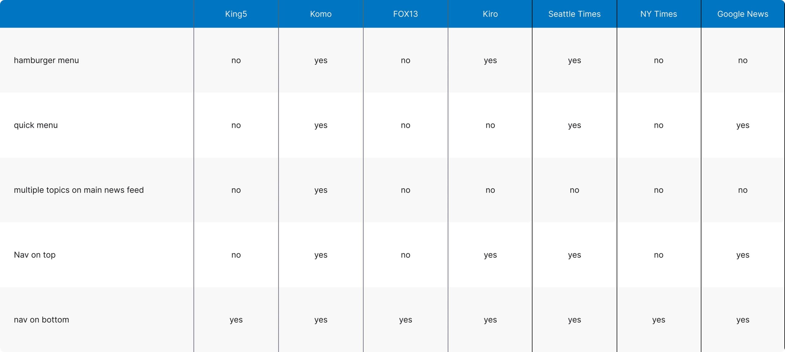
To gain a better understanding of what problem to tackle I conducted a competitive analysis and sifted through tons of user reviews to figure out where King 5 News stood and how we could make things better.
The competitive analysis shows King 5 falls behind in key areas, making competitors more appealing. For instance, the absence of a hamburger menu and quick navigation creates a confusing and less user friendly system.
There's a business opportunity here

A smoother navigation system and a broader range of news topics in the main feed can enhance user engagement and app retention.

User interviews

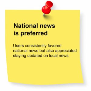
I interviewed 5 news app users, ranging from moderate to high everyday usage. They predominantly used NY Times, Seattle Times, CNN, and YouTube. The aim was to understand how users search for news stories and identify frustrations in app navigation.

Key findings

Usability testing

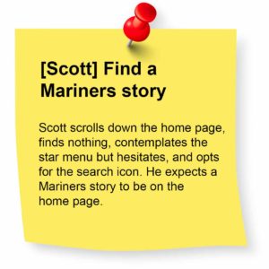
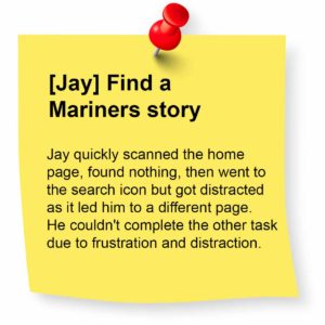
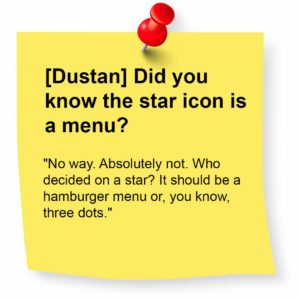
After asking participants about their preferred news app, I had them open the pre-downloaded King 5 News app. To keep the focus on their preferred apps, I limited questions about King 5 and assigned two main tasks.

  1. Locate a story on the Seattle Mariners (King 5 is Seattle-based)
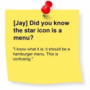
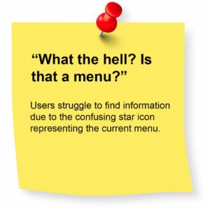
  2. What do you think the star icon in the top left corner represents?

The first question gauged their expectation for finding sports stories, while the second assessed the effectiveness of the star icon menu.

Key answers

Information architecture & wireframing

Armed with insights, it’s evident competitors have a useful navigation and meaningful, accessible content. King 5, on the other hand, suffers from confusing navigation and a lack of meaningful stories on the home page.

Now that I know what areas I need to improve on, I analyzed competitors’ solutions to see how they are solving these problems.

competitors solutions

Sketching and lo-fi prototyping

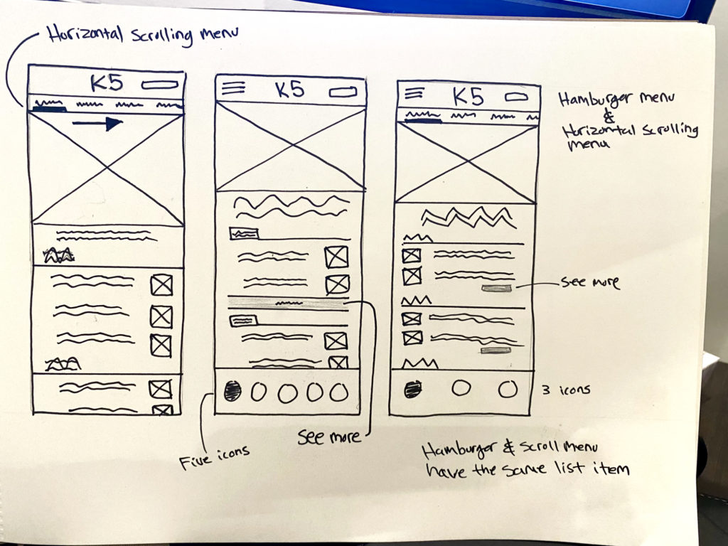
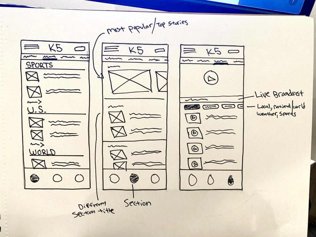
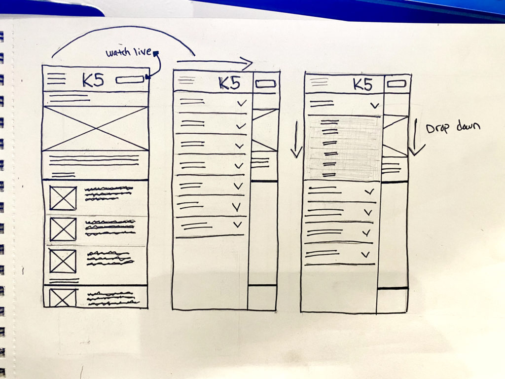
Now aware of areas for improvement, I started sketching to explore quick navigations, home page story layouts, and adding a hamburger menu for the design solution.

Sketching

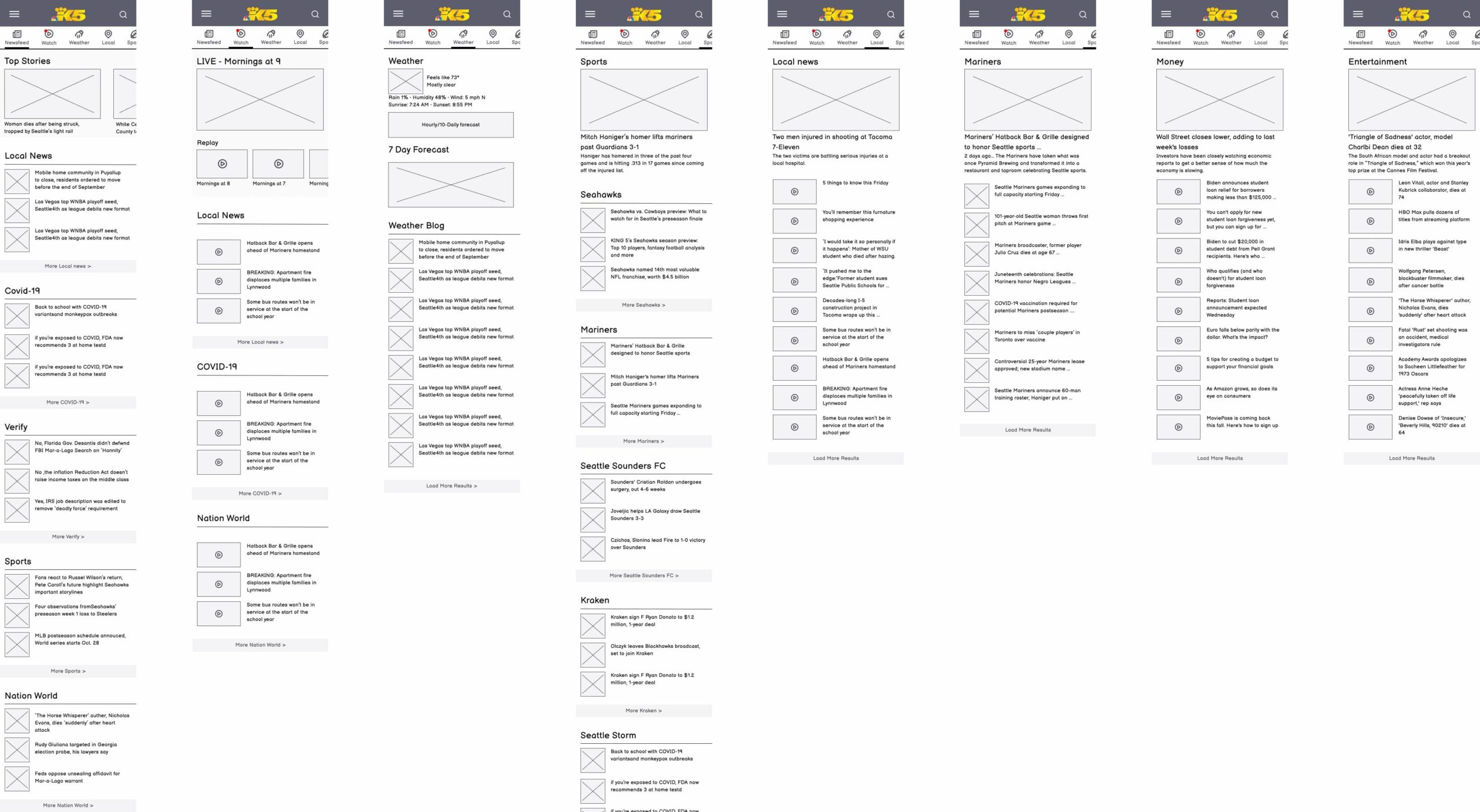
After sketching, I finalized the quick navigation, updated menu, and home page stories layout. I’m now ready for wireframing.

Wireframes

Lo-fi functional prototype

Hi-fi functional prototype

Usability testing of the lo-fi prototype garnered positive feedback, with users noting the absence of previous pain points. The improved navigation and ease of finding stories were particularly well-received. I’m now ready to finalize a high fidelity prototype. Enjoy!

Amazon | Customers Most Loved | Holiday Internet Famous videoAmazon | Customers Most Loved | Routines video banners

GET A HOLD OF ME


Connect with me on Linkedin

Connect with me on Linkedin

Resume

View my resume

© Jason Mckinney~ 2020 All Rights Reserved